

Mobile SEO: How To Optimize Your Site For Any Device. Mobile SEO refers to optimizing a website for mobile devices to improve its visibility and ranking in search engine results pages (SERPs) on mobile devices. Here are some ways to optimize your site for any device:
- Make sure your site is responsive, meaning it adapts to the screen size and resolution of the device being used to view it. This can be done by using a responsive design or a separate mobile version of the site.
- Optimize page load speed, as mobile users are less likely to wait for slow-loading pages. This can be done by compressing images, minifying code, and using a content delivery network (CDN).
- Use structured data, such as Schema.org, to help search engines understand the content on your site and display it in rich snippets in SERPs.
- Use mobile-friendly tags, such as the “viewport” meta tag, to ensure that your site is properly rendered on mobile devices.
- Optimize your site’s navigation and layout for touch-based devices.
- Make sure your site is accessible to users with disabilities by implementing accessibility features such as large text, high-contrast mode, and easy-to-use buttons and links.
- Use keywords that are relevant to mobile users in your content and meta tags.
- Use Google Search Console to track your mobile SEO performance and make adjustments as needed.
- Submit your site to Google’s mobile-friendly test and address any issues that it identifies.
1. Give Your Site A Responsive Layout & Mobile-Friendly Design
A responsive layout allows a website to adapt to the screen size and resolution of the device being used to view it. This can be achieved by using CSS media queries and a flexible grid system. A mobile-friendly design refers to designing a website that is easy to use and navigate on a mobile device. Here are some tips for giving your site a responsive layout and mobile-friendly design:
- Use a responsive grid system: This allows you to create a flexible layout that adapts to different screen sizes.
- Use a mobile-first design approach: Start by designing for the smallest screen size and then progressively enhance the design for larger screens.
- Optimize images: Compress images and use CSS to control their size and resolution, so they load quickly on mobile devices.
- Use a larger font size: Make text easy to read on small screens by using a font size that is at least 14px.
- Use a simple navigation: Keep the navigation simple and easy to use on a small screen by using large buttons and a clear hierarchy.
- Use touch-friendly buttons and links: Make sure buttons and links are large enough to be easily tapped on a mobile device.
- Make your site’s layout and design mobile-optimized: Make sure your site’s layout and design is mobile-optimized and easy to navigate with a finger on a small screen.
- Test your site on multiple devices: Test your site on a variety of mobile devices to ensure it looks and functions correctly.
By following these tips, you can give your site a responsive layout and mobile-friendly design that will provide a positive experience for mobile users and help you improve your mobile SEO.
2. How To Hand-Code A Responsive Website
Hand-coding a responsive website involves using HTML, CSS, and JavaScript to create a layout that adapts to different screen sizes and resolutions. Here are the steps for hand-coding a responsive website:
- Start by creating the basic structure of your website using HTML. This includes the head, body, and main sections such as the header, navigation, main content, and footer.
- Use a responsive grid system to create a flexible layout. This can be done using CSS grid or flexbox.
- Use CSS media queries to create styles that are applied based on the screen size and resolution of the device being used to view the website.
- Optimize images and other media to load quickly on mobile devices. This can be done by compressing images and using responsive image techniques such as the srcset attribute.
- Use JavaScript to add interactivity and dynamic behavior to your site, such as toggling navigation menus or adjusting the layout based on screen size.
- Use a mobile-first design approach, designing for the smallest screen size and then progressively enhancing the design for larger screens.
- Test your site on a variety of devices and browsers to ensure it looks and functions correctly on different screen sizes and resolutions.
- Use CSS to control font size, spacing, and other typographical elements to make text easy to read on small screens.
- Use touch-friendly buttons and links: Make sure buttons and links are large enough to be easily tapped on a mobile device.
Hand-coding a responsive website requires a solid understanding of HTML, CSS, and JavaScript, but it allows for more control and customization than using a pre-built framework. It also makes it easier to troubleshoot and optimize your site for specific devices.
3. How To Set A Viewport On A Website
The viewport is a meta tag that tells the browser how to adjust the website’s layout and scaling on different devices. Here’s how to set a viewport on a website:
- In the head section of the HTML document, add a meta tag with the name “viewport”.
- Set the content attribute of the meta tag to “width=device-width, initial-scale=1.0”.
Example:
<meta name="viewport" content="width=device-width, initial-scale=1.0">
This tells the browser to set the width of the viewport to the width of the device and to set the initial zoom level to 1.0, so that the website is displayed at its actual size.
Additionally, you can also set other parameters like maximum-scale, minimum-scale, and user-scalable to control how much users can zoom in and out.
Example:
<meta name="viewport" content="width=device-width, initial-scale=1.0, maximum-scale=1.0, minimum-scale=1.0, user-scalable=no">
This tells the browser to set the width of the viewport to the width of the device, set the initial zoom level to 1.0 and the maximum and minimum zoom level to 1.0 and prevent user from zoom in or out.
By setting a viewport, you ensure that your website is properly rendered on different devices and screen sizes, and that users have a positive experience when viewing your site on their mobile devices.
4. How To Add The Max-Width To Make Your Images Responsive
To make images responsive on a website, you can use the CSS max-width property to set a maximum width for the images. This ensures that the images will scale down when viewed on smaller screens, but will not scale up larger than their original size. Here’s how to add the max-width to make your images responsive:
- In your CSS file, add a class or ID to target the images on your website.
Example:
.responsive-image {
    max-width: 100%;
}
2. Apply the class or ID to the images in your HTML file.
Example:
<img src="image.jpg" class="responsive-image">Add the CSS property max-width to the class and set its value to 100%. This tells the browser to scale the image down to the width of its parent container but not more than 100% of its original size.
You can also set a specific max-width value in pixels or a percentage of the viewport width, depending on your needs.
Example:
.responsive-image {
    max-width: 50%;
}
This tells the browser to scale the image down to 50% of its original size or the width of its parent container whichever is smaller.
5. How To Install A Fluid Layout
A fluid layout is a type of website layout that automatically adapts to the size of the browser window. Here’s how to install a fluid layout on your website:
- Start by creating the basic structure of your website using HTML. This includes the head, body, and main sections such as the header, navigation, main content, and footer.
- Use CSS to create a flexible grid system. This can be done using CSS grid or flexbox.
- Set the width of the main sections of your website using percentages instead of fixed pixels.
.container {
    width: 80%;
    margin: 0 auto;
}
4. Use media queries to change the styling of your website at specific breakpoints, such as when the screen size is below a certain width.
@media (max-width: 767px) {
    .container {
        width: 90%;
    }
}
5. Use JavaScript to add interactivity and dynamic behavior to your site, such as toggling navigation menus or adjusting the layout based on screen size.
6. Test your site on a variety of devices and browsers to ensure it looks and functions correctly on different screen sizes and resolutions.
7. Use CSS to control font size, spacing, and other typographical elements to make text easy to read on small screens.
8. Use touch-friendly buttons and links: Make sure buttons and links are large enough to be easily tapped on a mobile device.
By using a fluid layout, your website will automatically adjust to the size of the browser window, providing a consistent and optimal viewing experience for users on different devices.
6. How To Add Media Queries To Your Website
Media queries are a CSS technique that allows you to apply different styles to your website based on the characteristics of the device or screen on which it is being viewed. Here’s how to add media queries to your website:
1. In your CSS file, add a media query at the bottom of your CSS styles. The media query should include a media type (such as “screen”) and a set of conditions (such as “max-width”).
Example:
@media screen and (max-width: 767px) {
    /* styles for screens smaller than 767px */
}
2. Inside the media query, add the CSS styles that you want to apply when the conditions are met. These styles will only be applied to devices that match the conditions specified in the media query.
Example:
@media screen and (max-width: 767px) {
    .container {
        width: 90%;
    }
    /* other styles */
}
Repeat step 1 and 2 for different breakpoints and devices.
Example:
@media screen and (max-width: 600px) {
    /* styles for screens smaller than 600px */
}
@media screen and (min-width: 768px) {
    /* styles for screens larger than 768px */
}
Test your website on different devices and screen sizes to ensure that the media queries are working as expected.
By using media queries, you can create a responsive design that automatically adapts to the size and capabilities of the device on which it is being viewed. This ensures that users have a positive experience when viewing your site on their mobile devices.
7. Make Your Full Website Look Good On Mobile
Making a website look good on mobile devices requires a combination of responsive design, mobile optimization, and best practices for mobile web development. Here are some tips for making your full website look good on mobile:
- Use a responsive design: Use a fluid layout, CSS grid or flexbox, and media queries to make your website automatically adjust to the size of the device’s screen.
- Optimize images: Reduce the size of images and use the “srcset” and “sizes” attributes to serve different versions of images depending on the device’s screen size and resolution.
- Prioritize mobile-friendly content: Use a mobile-first approach to prioritize the most important content and functionality for mobile users.
- Make your website fast: Make sure that your website loads quickly on mobile devices by compressing images and other resources, using a content delivery network (CDN), and minimizing the use of heavy scripts and plugins.
- Optimize for touch: Make sure that buttons, links, and other interactive elements are large enough to be easily tapped on a mobile device.
- Simplify your navigation: Use a simple, intuitive navigation menu that is easy to use on a small screen.
- Use a mobile-friendly font: Choose a font that is easy to read on mobile devices and adjust font size, spacing, and other typographical elements to make text easy to read on small screens.
- Test on multiple devices: Test your website on a variety of mobile devices and browsers to ensure that it looks and functions correctly on different screen sizes and resolutions.
How To Discover Your Website’s Technical Errors
There are several ways to discover technical errors on your website, including:
- Using webmaster tools: Google Search Console and Bing Webmaster Tools provide detailed information about crawl errors, broken links, and other technical issues on your website.
- Running a site audit: Tools such as Ahrefs, SEMrush, and Moz can scan your website for technical errors and provide a report of any issues that need to be fixed.
- Checking your website’s load time: Use tools like GTmetrix or Google PageSpeed Insights to check your website’s load time and identify any issues that may be slowing it down.
- Testing your website’s functionality: Use tools like Selenium or TestCafe to automate testing of your website’s functionality and identify any errors that may be preventing it from working properly.
- Monitoring your website’s uptime: Use tools like Uptime Robot or StatusCake to monitor your website’s uptime and be alerted if it goes down.
- Reviewing your website’s server logs: Your server logs can provide valuable information about errors that are occurring on your website.
It’s important to regularly check your website for technical errors, as they can negatively impact your search engine rankings, user experience, and conversion rates.
Make Your Site Load Quickly
You visit your site, and it’s taking too long to load. Oh no!
Is the Internet down? No? Unfortunately, now your user may decide that your website never works and never return.
So, it’s important to do everything in your power to make sure your site loads quickly at all times.How To
Make Your Website Load Faster
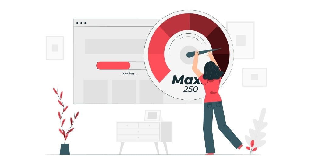
Here are some ways to make your website load faster:
- Optimize images: Compress images and reduce their file size before uploading them to your website.
- Minimize HTTP requests: Reduce the number of resources that need to be loaded by combining and minifying CSS and JavaScript files.
- Use a Content Delivery Network (CDN): A CDN stores copies of your website’s files on servers located around the world, allowing users to access them from the nearest location, which can significantly reduce load times.
- Enable browser caching: Browser caching allows your website’s files to be stored locally on a user’s computer, so they don’t need to be re-downloaded each time a page is accessed.
- Use a fast web host: Your web host can have a big impact on your website’s load times. Look for a host that uses solid-state drives (SSDs) and has a strong network infrastructure.
- Remove unnecessary plugins and add-ons: Too many plugins and add-ons can slow down your website. Remove any that you don’t need or that are not actively being used.
- Optimize your database: Over time, your database can become cluttered with unnecessary data. Optimizing your database by removing old data and indexes can help speed up your website’s performance.
- Lazy Load images and videos: Lazy Loading means loading images and videos as the user scrolls down the page. This way the images that are not visible on the screen don’t slow down the loading time of the website.
Keep in mind that this is not an exhaustive list, but these tips should help you to improve your website’s load time. It’s also important to regularly test your website’s load time and make adjustments as needed
Make Your First Scroll Efficient

Ideally, you should be able to captivate the visitor as soon as they see your website. But there is only so much they can see on a small screen. So, what do you do?
Make your site’s “above the fold” (what users see in the first scroll) is a total knockout.
What are the must-haves you must put in there?
- Descriptive, eye-catching title.
- Navigation menu.
- Search bar.
- Call-to-action.
But those are just the basics.
Here are a couple of expert-level ideas:
- An interactive element (like a panoramic photo, a 3D model, or a simple game). Even an ordinary video works.
- A floating CTA that always stays on the screen no matter how far down you scroll.
Make Your Search Results Attractive
Here are some ways to make your search results more attractive:
- Use structured data: Structured data, such as schema markup, helps search engines understand the content on your website, allowing them to display more detailed and relevant information in search results.
- Use rich snippets: Rich snippets, such as those for reviews and recipes, can make your search results stand out and provide more information to users.
- Optimize your title tags and meta descriptions: Title tags and meta descriptions are used by search engines to display information about your website in search results. Make sure they are clear, concise and relevant to the content on your page.
- Optimize your images: Optimize images by using descriptive file names, alt tags, and captions.
- Use social media integration: Integrate your website with social media networks to show social proof in search results
- Use video snippets: Video snippets can be a great way to make your search results stand out.
- Use Google My Business: If you have a local business, create a Google My Business listing and make sure it’s complete, with accurate information and updated photos.
- Use Google Featured Snippets: Optimize your content to be able to get featured in Google Featured Snippets, this way you will be able to have a higher click-through rate.
Keep in mind that these tips will also help you with your SEO and your click-through rate, but there’s no guarantee that it will make your website appear at the top of search results, as the ranking is determined by many other factors like relevance, authority, and user behavior.
Years ago, Google saw the potential in mobile devices – and, as it turns out, they were completely right.
The search giant invested greatly in mobile friendliness, and there’s no doubt: the Internet is so much better for it. Online content has become much easier on the eyes and simpler to use.
But does your site match the gold standard? Do your users get the same great experience across all of their devices?
If you have even a shadow of doubt, it’s time to employ every tool at your disposal to make sure your site meets the mark.